One of the coolest parts of the hobby for me is taking immersive pictures of my painted miniatures, like the kinds you seen in my narrative posts. The way I created the background was to print a large stock photo, glue it to a foam core panel, and propping it behind the terrain and game mat. While this worked fine, it was annoying to use as the picture would fall often and I had to shoot at very specific angles to make it work. I also tried out using a lightbox setup, but I wasn't satisfied with that look either. So I made a new photo booth instead. I took some pictures and I'll provide steps on how I made it.
Materials and Tools
XPS Foam, 2'x2'.
Velcro Adhesive Strips
20''x30'' Photo
Paint (Black, Dark Grey, Light Grey, White)
Foam Cutter (Either knife or hot wire)
Large Paint Brush
Scissors
Aluminum Foil
Step 1: Photo Backdrop
The background photo is the most important part of this build, as it will determine the overall feel of the photo booth. It has to fit with the setting that you work in, so for fantasy there can't be any modern items in the background, like telephone poles which can pop up in a lot of landscape photos. The scale also has to fit the type of models you will be photographing. This is more of a feel than a science, but you can gather what should look right with your models.
Another important item is the resolution of the photo. These pictures will be printed at a 20''x30'' size, which requires high definition photos. I used Pexels to browse for high def photos, and the added benefit is that these are free stock photos, and often don't require attribution so you can just throw it onto your blog or instagram or similar. Once I had chosen what backgrounds I wanted (I chose 3), I downloaded them and got them printed.
Here in the US, I used Costo Photo Center, which I like as it is cheap and the online tool tells you if the photo you chose is too low resolution or requires cropping to fit the size. I chose the 20''x30'' poster option, which runs $9.99 per photo, at the time of this tutorial. Once selected you can move on to the next step.
Step 2: Shaping the Base
The base of the photo booth is made from XPS Foam, which you can buy at a hardware store. It should be in the insulation section, and comes in different sized panels and a variety of colors. I got the pink 2'x2', as this is the most common material crafters use for terrain as it is easy to cut and texture. This sheet cost me about $5, and you only need the one.
Next I measured out cuts I was going to make. First I cut a rectangle that was 24'' wide and 14'' tall, as I didn't want a large board for storage reasons. Before I made the cut I made sure that I could still take a picture with the largest and tallest models I had with the base still in view. On each end of the rectangle, I measured 10'' on each short end and drew a point. I then drew another mark at the midpoint of the long side closest to the 10'' marks. I then drew a symmetrical curve connecting these 3 points.
I made the back of the diorama curved for two reasons. For one, it means that I can take photos from different angles instead of straight on like before. Secondly, the curve gives rigidity to the photo, so that I don't have to glue it to posterboard to get it to stand up straight. The curve is relatively shallow so as not to make the background too obvious. You will also note that the background is larger than the base. Honestly, that just boiled down to the fact that the store didn't have any larger foam panels.
When you make these cuts you can use either a knife or a hot wire cutter. If you use a knife, make sure it's nice and sharp so that you don't tear the foam, as a smooth finish is important. If you use the hot wire cutter, use it in a well ventilated area. I went outdoors to cut mine.
Now all that's left is to texture the foam. Pick a side to be the top surface, then take some aluminum foil, crumple it into a ball, and roll it along the surface you chose. This will give the foam the appearance of stone. You can do as much or as little of this as you'd like, or even switch out for a different texture. I went with stone as it is the most "neutral" surface to me, and can go with any of the base designs that I use for my minis.
Step 3: Connecting the Background to the Base
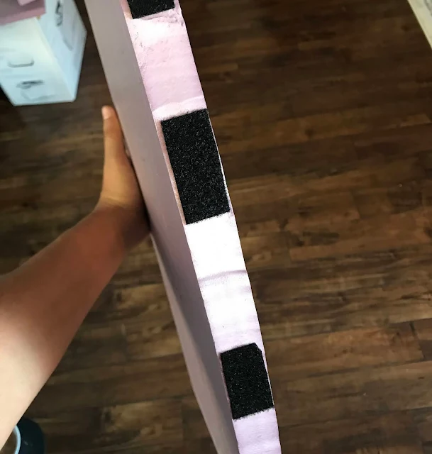
Take the velcro adhesive and cut six strips of the "loop" side and stick it to the curved side of the base. Firmly press and hold these as they will be seeing a lot of use. Cut six strips of the "hook" side of the velcro of the same size, and velcro them to the "loop" sides on the base, but leave adhesive covering while you do this.


Great idea! Well done. I like the fact that the background image is curved. Haven't thought of that in my tutorial over at https://www.agentlemanlysport.com/miniature-photography-studio-background/ .
ReplyDeleteThanks! Always love to find other creators with similar ideas, really liked the small format you used since you can try a bunch of different things quickly or get more intimate.
Delete