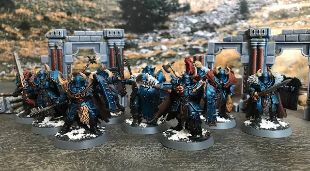
Get your brushes and clippers, and welcome to the Space Dinosaur Hobby Table, where I cover what I've completed recently in the Age of Sigmar hobby, along with my thoughts on the sculpts, how easy they're to paint, and any tips or tricks I can pass on to make your life easier. Today's post is all about the new Chaos Warriors sculpts and how they compare to the older classic models.
In the interest of brevity, I won't cover my paint scheme in depth as I've covered it a few times before. But I always get questions on how I get the blue color, and, to put it simply, it's Contrast blue over a metallic base. That's it, no shades or anything. There's a ton of different hues of blue you can use, so go wild with this technique. If you want to take it a step further, drybrush a lighter metallic color once the Contrast is fully dry.
With that out of the way, we can talk about the sculpts. A ways back I painted the old Chaos Warrior sculpts from the original Slaves to Darkness Start Collecting box. At the time, I thought they held up pretty well, but after painting these new sculpts I can really see the age of the older ones. Especially how uniform each model is, and it only gets worse as you rank them all together and see that each and every cape flow in the exact same way. I see a lot of the old guard bemoaning the lack of customization of newer models. In reality, the customization that you got was head and shield swaps. Sure, there's some minor variation, but that gets lost at a distance. I think a lot of people forget that you play this game from 3 feet away and not with the models pressed up against your face.
The other big difference is posing. The old models are very rigid, with arms tucked in and elbows at 90 degree angles. The shield is always right up front, blocking a lot of the front of the model. The new ones mix up the location of the shield, lending a really dynamic feel to the models. The shields are also all different with really interesting designs engraved on them, better than the flat shields of the originals.
Another thing that's way better are the capes. Gone are the capes that all flow in the same direction. Now every warrior is unique, especially from those all important 3 feet away. It also makes them more fun to paint, but with all of the extra detail it does add up to more painting time. That's been a trend overall in Age of Sigmar though, and I both love and hate it.
Now for my overall thoughts on the models, I will judge them based on two categories. Firstly, the sculpt itself will be scored on a scale of 0 to 10, with 5 being average, 0 horrendous, and 10 a marvel. For a reference point, I consider the Stormcast Liberator to be a 5, neither great nor bad. Just a passable, average model. Then I will score on Ease of Painting, between 1 and 5, 1 being a slog to paint and 5 being a breeze.
My new Chaos Warriors review:
Sculpt: 8/10
I think that these are an excellent re-imagining of a classic sculpt, and hits all of the right notes. GW just needs to release a non-easy to build kit so that units larger than ten don't have a bunch of repeats.
Ease of Painting: 2/5
They're covered in so many small details that it makes it difficult to paint the whole unit quickly and easily.
Final tips: Keep the shields off to make it easier to paint behind them.
-The Space Dinosaur
On a separate note, I've completed a whole shelf of Slaves to Darkness models. Hooray for progress!


No comments:
Post a Comment